Toward the end of each year, paint manufacturers and other experts announce their Colors of the Year. These highly anticipated declarations offer a reflection of life and society in the moment—our collective mood, influences, and emotional drivers—and guidance for the months ahead.
Some of this year’s prominent 2024 Colors of the Year selections divide neatly into two distinct categories: softer, more relaxed tones answering our mutual desire for peace and calm in a messy world, or bolder, dramatic hues delivering much-needed energy. Though the two sides are notably different, common themes include interpretations of “warmth,” “peace,” and “well-being.” All of the options, light or dark, evoke a depth and saturated richness that draw you in and strengthen each color’s versatility throughout the interior and exterior.
Rich and Relaxing Colors of the Year
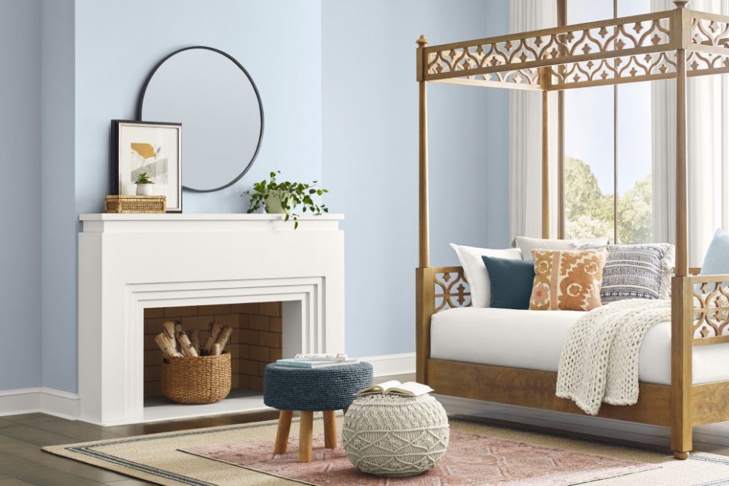
Sherwin-Williams: Upward
Described as a “breezy, blissful blue,” Sherwin-Williams’ Upward (SW 6239) is “a sunny-day shade for spaces brimming with positive energy, creative thinking, and total contentment.” Like the company’s 2023 color, Redend Point, the shade is soft but rich, soothing yet eye-catching, a way to make a statement without feeling overwhelmed. Pair it with greige neutrals, black, olive or honeydew green, or a desert brown.

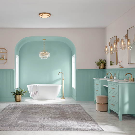
Valspar: Renew Blue
Similar to Sherwin-Williams, Valspar’s Color of the Year, Renew Blue, is a soft-yet-rich hue in the blue family, but with green influences that lend a peaceful vintage feel evoking a sense of calm. “Most of us are seeking an end to feeling overwhelmed—less stress, less information, less technology, fewer choices. Simplicity,” the company said. “Here, we can slow down and create the peaceful place we seek.”
Pair it with mid-toned neutrals in tan and greige.

Pantone: Peach Fuzz
Pantone’s Peach Fuzz is “a velvety gentle peach whose all-embracing spirit enriches mind, body, and soul,” the global color authority says, noting that our need for nurturing, empathy, and compassion was a driver for this year’s selection. A “warm, cozy shade” between pink and orange, Pantone says Peach Fuzz offers a fresh approach to softness, with gentle lightness and a vintage vibe for a subtle sensuality that evokes new modernity.
“Pantone 13-1023 Peach Fuzz brings belonging, inspires recalibration, and an opportunity for nurturing, conjuring up an air of calm, offering us a space to be, feel, and heal and to flourish from whether spending time with others or taking the time to enjoy a moment by ourselves,” said Leatrice Eiseman, executive director for the Pantone Color Institute. “Drawing comfort from Pantone 13-1023 Peach Fuzz, we can find peace from within, impacting our wellbeing. An idea as much as a feeling, Pantone 13-1023 Peach Fuzz awakens our senses to the comforting presence of tactility and cocooned warmth.”

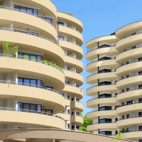
PPG: Limitless
Limitless, a creamy, soft yellow from PPG, “instills a warm, sunny vibe that hints at growth and blooming energy,” the manufacturer said. By offering both “the power of a primary color and the essence of a neutral,” Limitless is, as its name suggests, a versatile option for interior and exterior applications as a full-body color or as an accent. The hue’s soothing vibe is in sharp contrast to vivid Vining Ivy, a Caribbean aqua, the company’s previous-year selection.

Bold and Energetic Colors of the Year
Behr: Cracked Pepper
Confident and dramatic, Cracked Pepper from Behr is a versatile soft black that can make a statement as the primary focal point in the room or as a simple, classic accent. Lush and elegantly moody, Cracked Pepper provides a perfect contrast against creamy whites but is rich enough to stand alone without overpowering the space.

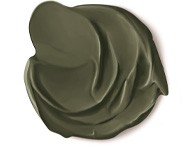
Dutch Boy: Ironside
Another color selection that is dark but lush is Ironside, a deep olive that Dutch Boy describes as a “richly dimensional hue that soothes and reassures.”
“Creating a space for wellness should be a driving factor in everyday life,” said Ashley Banbury, color marketing manager for Dutch Boy. “That’s why taking a natural approach to healthy living and safe spaces is a pivotal part of the current landscape. Dutch Boy Paints’ 2024 One-Coat Color of the Year—the stunning, strong Ironside—incorporates all the above in one bold color and can be applied in one single coat.”
The company says the color provides a sense of sophisticated comfort behind furniture, art, and accessories.

Benjamin Moore: Blue Nova
The blue-violet of Benjamin Moore’s Blue Nova offers “depth and intrigue, balanced by an undercurrent of reassurance,” the paint manufacturer says. “This alluring mid-tone features an enchanting duality, capturing the spotlight with endlessly classic appeal.”
The company’s larger trending 2024 color palette features softly saturated hues for a nuanced contrast. “On adventures near or far, we encourage collecting poignant color moments with verve and personality that are unexpected and boundlessly magical.”
From Colors of the Year to exterior trends, get the latest insights by subscribing to our monthly enewsletter.


